
Website Redesign
Shoal Creek Country Club is an historic club that needed help with their design direction. Working with the clients, I was able to pull out essential information about their goals, users, and design preferences to steer the project in the right direction and deliver a design the client was excited to launch.
01. Design Meeting
Before meeting with the client I conducted a thorough research and discovery phase to have a solid understanding of the club, their mission, and their clientele. I had them send over any assets, logos, color and font preferences, as well as any other preferences or must-haves for their new website. After gathering this information I put together a presentation where we went through all of their assets, and followed with design examples and features I thought would work well for their new website. Initially, the client wanted to stick with a very minimal homepage. However, after showing them some extra features that would help communications between the club and their users and members, I was able to open their eyes to design features they had not initially considered.
The original site was past-due for a redesign and a fresh look with new features.

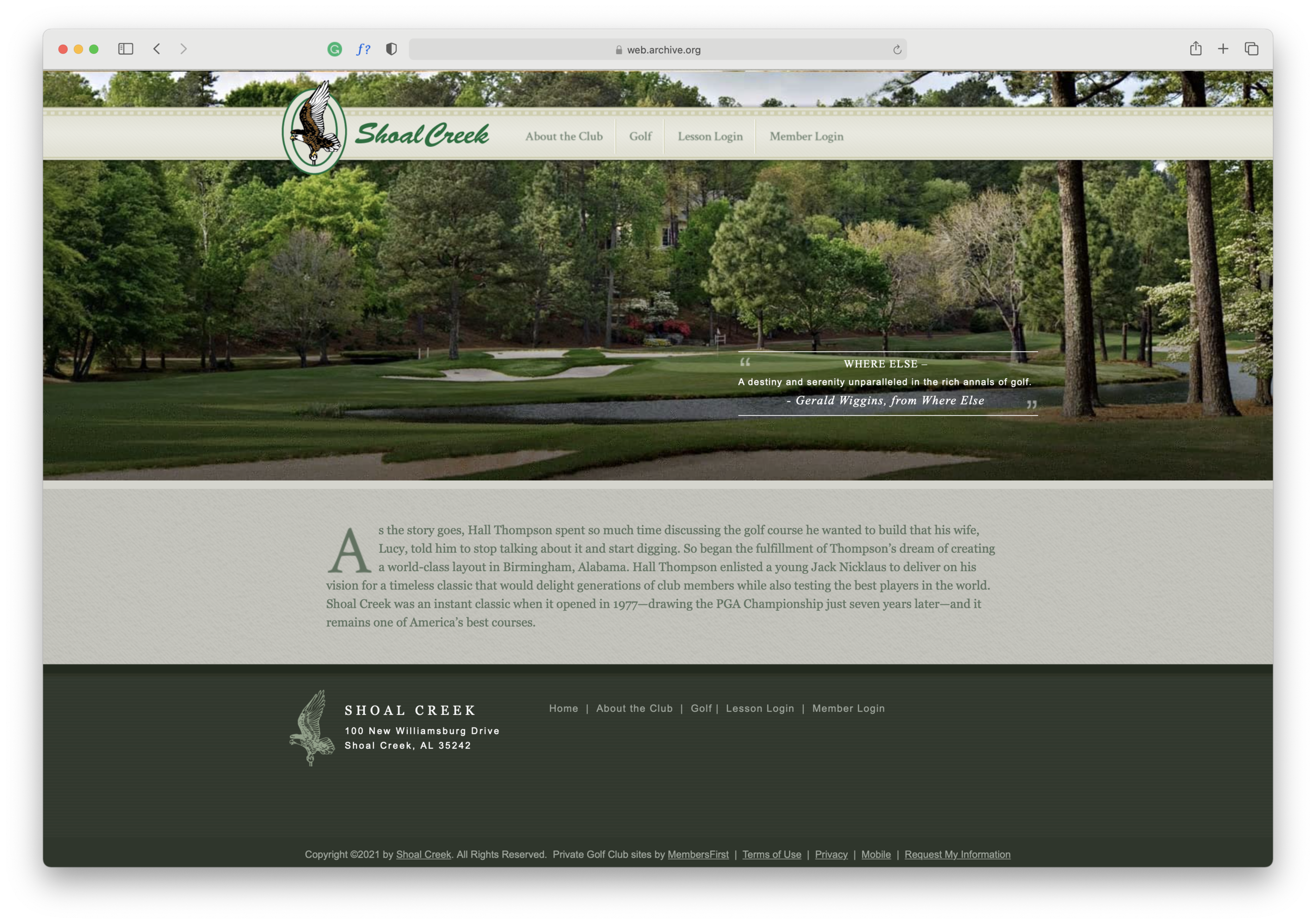
02. Homepage Review
+ Vision Board
During my design meeting I made sure to do a thorough review of their current website. I wanted to ensure I kept the aspects of the design they liked, as well as go over any existing content they felt was essential to the new site. Their previous site was quite old, so there was very little about it they liked. Initially, they wanted to keep the same fonts but after seeing my vision for the redesign project they were very enthusiastic about seeing more modern and clean fonts. We decided to stick with a similar color palette, as it is echoed throughout the whole clubhouse. I put together a vision board to present before the new homepage design so the client could have a better understanding a feel for the design decisions I made.


03. Homepage Designs
The colors and fonts that we decided on keep the homepage looking clean while honoring the Club’s more traditional feel. They requested their video tour of the club be prominent on the page, so I decided on a full-width layout directly below the welcome area. Below that I use text on alternating sides of the page with correlating images to keep the visual interest of the user experience.
This design was to be coded using the Bootstrap framework, and all items on the page needed to respond to a mobile environment. Keeping that in mind, I made sure to stick to the 12 column layout that Bootstrap utilizes.
Another challenge was to create each section element individually so that if any elements are “turned off” within our CMS the page will still flow nicely and look cohesive. You can view the current live site here, while keeping in mind that some page elements may not be currently active.