
Website Redesign & Branding Refresh
Neptune Cove needed a big refresh. The site was outdated and users had a hard time navigating the site and finding what they were looking for. I was designated the design lead on this project and saw it through from initial concept presentation to development.
01. Design Meeting
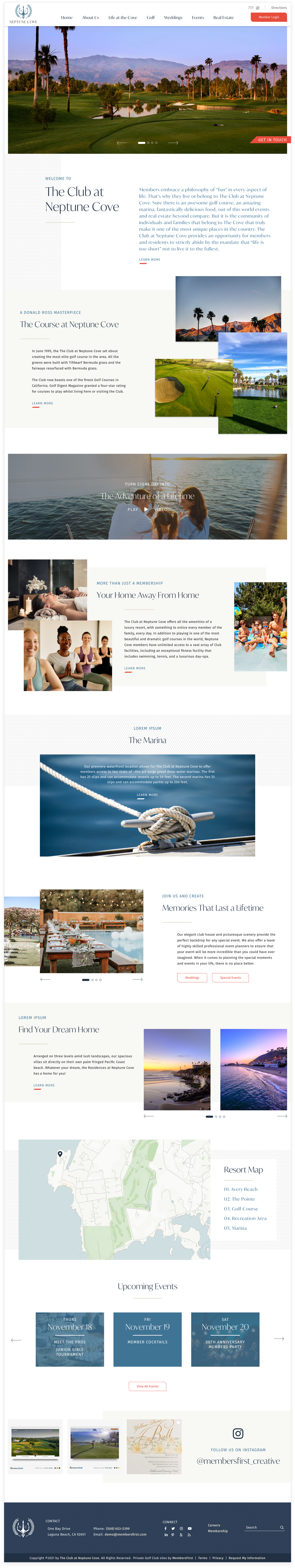
I met with the stakeholders for this project and they expressed a desire to really modernize and clean up the site while making it easier to navigate. I proposed a few ideas and we looked at different aspects from websites they liked and had a good user experience with. From there I came up with two designs which I pitched in a follow up meeting. They loved the color palette from one and the fonts and designs from another, so we combined the two and landed on a homepage design which led the direction for the rest of the website.

02. Homepage Creation
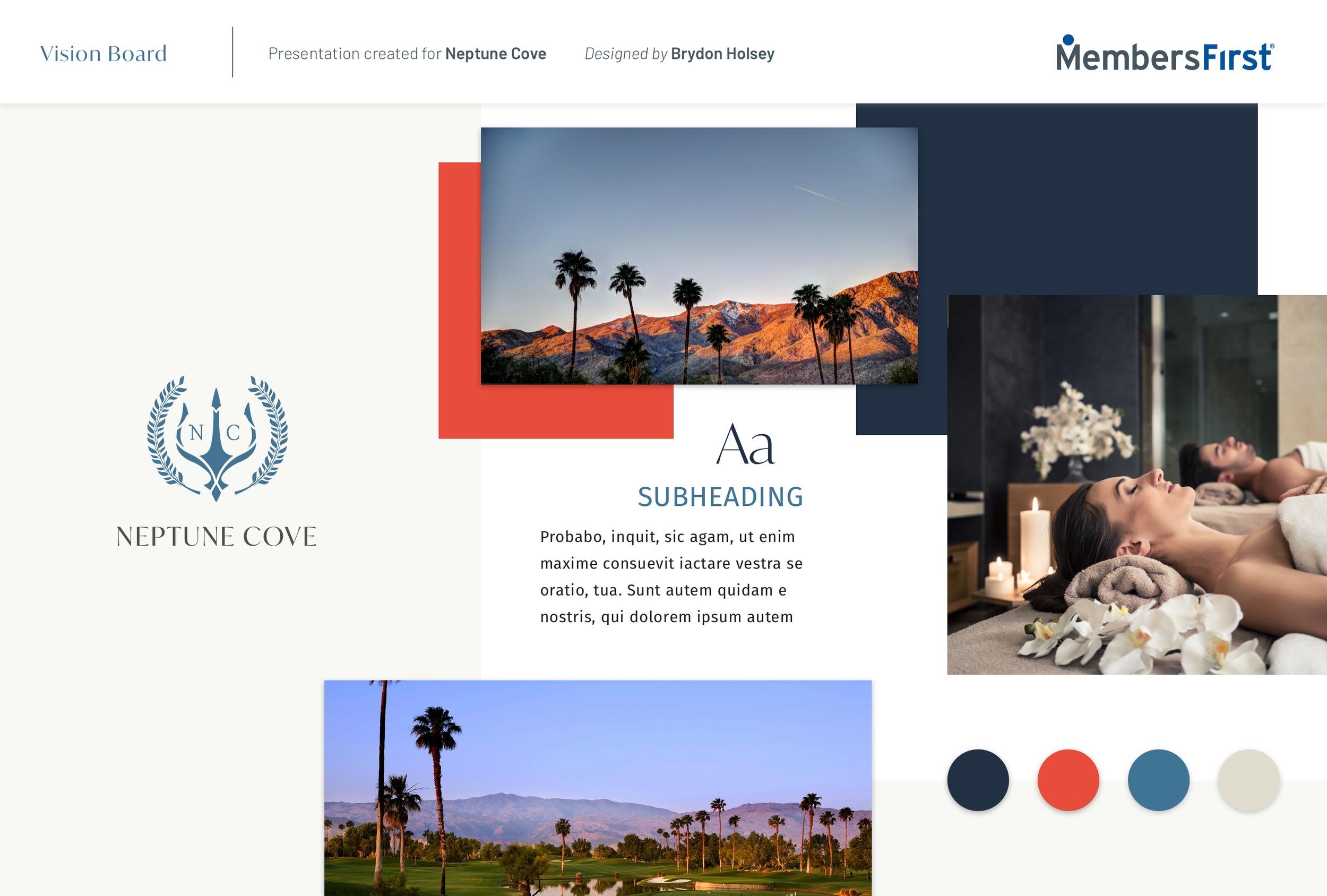
After the design meeting I came up with two homepage designs, of which we chose aspects of each design and incorporated into one cohesive design. The client wanted to use “sharp blues” with a pop of color. I went with navy blue as the primary color, with a lighter stone blue as an accent. For the pop of color I chose a deep coral red that also complies with WCAG 2.0 standards. For the fonts I chose a modern serif font for headings and a clean sans serif for body text. I created a prototype in adobe XD that also showed hover effects so the client had a really good sense of how this project would behave after development.
03. Internal Page
After edits and approval of the home page we moved on to the internal pages. These custom pages followed the design of the homepage but added new elements to accommodate the content for each page. While I designed the homepage on my own, the internal pages were a collaboration between myself and one other designer on our team.
