Social Campaign, Website Design + Code-out
A campaign created for people wanting to make small adjustments to their daily habits to help save our planet.
01. Iterations
This project was part of my graduate degree where we had the opportunity to work with a real client to develop an idea they wanted to bring to life. The idea was in the very first infancy stage, so we had the opportunity to come up with our own campaign slogan, logo, and marketing ideas.
The clients idea was that if everyone made a few small changes a day it would add up to a huge positive impact on the fight against climate change. I spent a few days mulling over some ideas until finally landing on 321IMPACT. I felt there was great opportunity for a creative logo and simple phrase that would resonate with people.
02. Logo Development
The logo was going to dictate most of the rest of my designs. I wanted to use strong colors and a font that would translate easily to the web. I also wanted to incorporate elements from the earth into the numbers to give viewers a sense of what the logo might stand for, even without knowing anything about the campaign. After a few loose drawings I turned to Illustrator to get a more solid foundation for fonts and colors.
-

Logo Version 1
I wanted to create a logo that was colorful, incorporated pieces of the earth and nature, and played on the word “ACT” within “IMPACT”. This was my first iteration of the logo, and one that I felt was headed in the right direction but needed some cleaning up.
-

Logo Version 2
By changing the font to something a little more slender I was able to streamline the logo a bit and make it look much less clunky. This font was also readily available through google fonts, so it would be easy to translate to web design. I felt the colors were not quite right on this version, so after playing around with those I landed on my third and final version of the logo.
-

Logo Version 3
After changing the colors up and making some minor adjustments to the images inside of the “321” part of the design, I felt I landed on a logo that would work very well with my campaign ideas. The colors stood out and grabbed your attention, and the icons within the design would give me ample opportunity to bring those ideas through to other brand and design elements.

03. Style Guide + Mood Board
After creating the logo I put together a style guide and mood board to guide the style choices in the rest of my campaign designs. Because the logo had such bright, vibrant colors I wanted to keep other elements more simple and clean. I decided on a modern sans-serif font that complimented the logo nicely and was easy to read. I wanted to use the red from the logo for most headings and buttons, while incorporating the blues and greens into other less prominent design aspects.
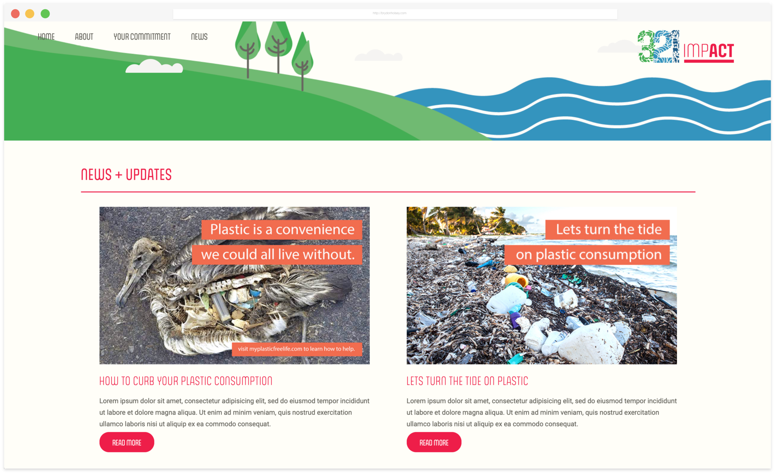
04. Website Design + Codeout

The website was going to be a huge part of this campaign. It had to be easy to navigate, make a statement, and give the user an easy way to participate. I wanted to keep it clean and simple, incorporating iconography and simple illustrations into the design.
I wanted to incorporate larger design elements like the waves and shoreline to break up the sections. I felt this gave the content a reference for what it was and some visual interest so the page wasn’t all text.